- June 26, 2011
- 32
- 26
- Home Country
-
 United States of America
I earn a lot of my income from web design; so I'd like to offer my opinions and assistance.Hi,
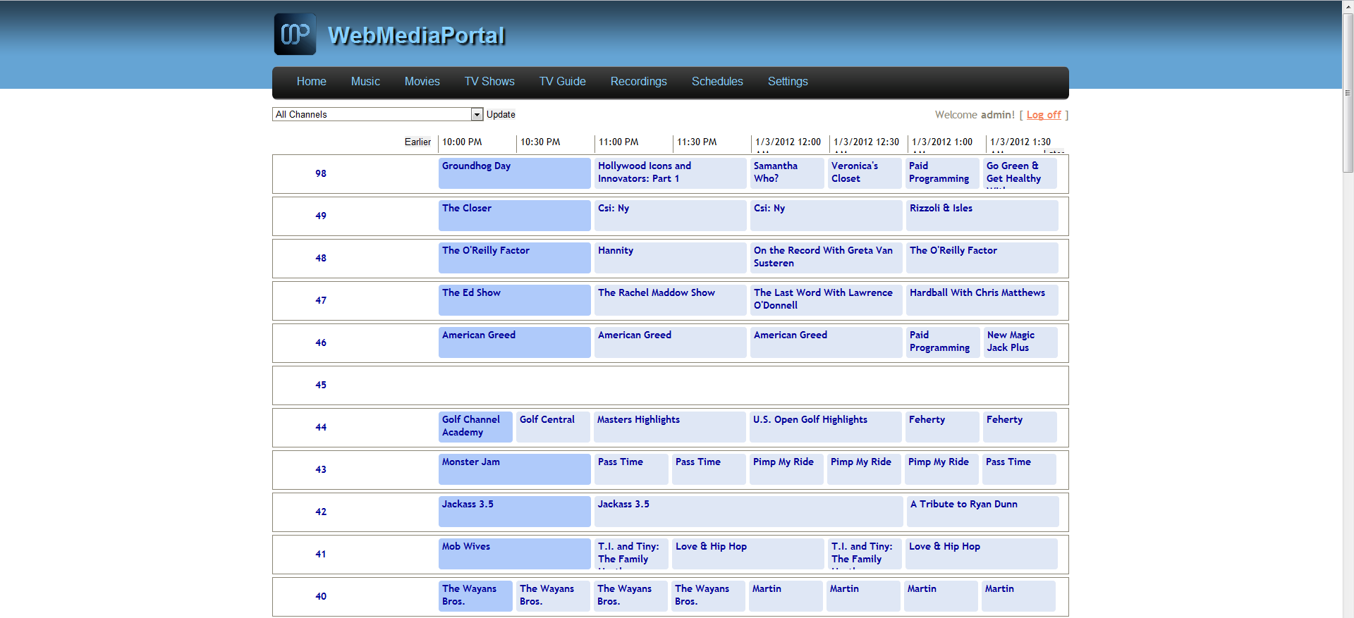
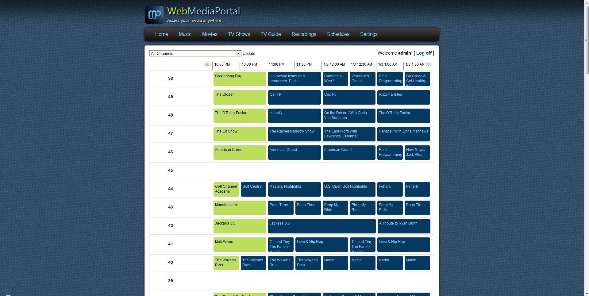
since i'm currently reworking WebMediaPortal's ui (thx@thundercats) i would like to get a bit feedback on the overall impressions.
It's obviously in an early state so there will be many changes...
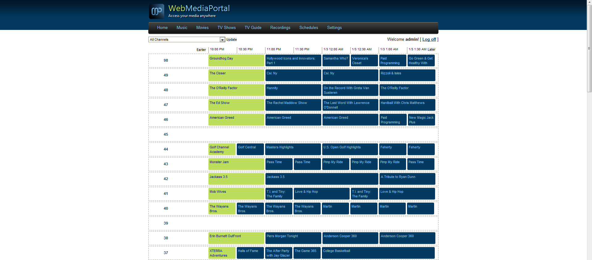
First and foremost, I'm going to have to put my vote toward no on the side buttons. Images and icons will be somewhat difficult to make clear enough to be more useful than text labeled buttons: "TV shows" vs "TV guide" for example. I would return to the horizontal navigation from the default layout. However, I would remove the dotted borders, add a gradient bar, bevel the buttons, and add a text highlight on mouse over.
Secondly, the teal is ok, but i would shy away from having the content area be colored. It makes reading the titles more difficult than it should be, and it looks less clean. Have a gradient teal for the header/footer but leave the content area white. (this assumes horizontal nav)
Lastly, something you're probably working on so you can take this with a grain of salt, the titles need to be styled and given a margin. I might also suggest that some uniformity with the thumbnails be achieved. It will look a lot cleaner if you can try to keep them all the same size & form factor. That may be something of a challenge to accomplish, but it would be a desirable change.
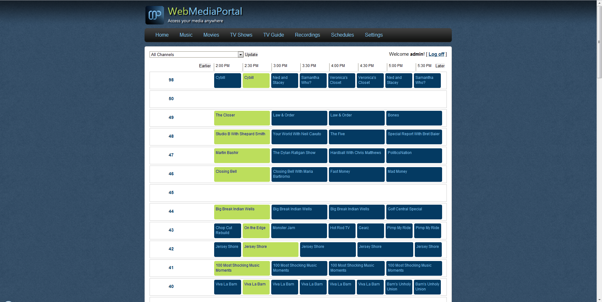
I'm having some trouble picking up design projects lately, and I have some free time if you'd like my help. In fact, I may just draft up a concept now.
")
I went ahead and attached a screenshot of what I got done in an hour or so tonight. Still playing with a few colors, but I wanted it to feel more like the media portal site. I'm also aware of the text being cut off on the labels, I haven't got to that yet. Just wanted to give an example of what I had in mind.