
You are using an out of date browser. It may not display this or other websites correctly.
You should upgrade or use an alternative browser.
You should upgrade or use an alternative browser.
Black Glass Skin 1.5.1 (1 Viewer)
- Thread starter Tgx
- Start date
- March 24, 2007
- 12,070
- 7,459
- Home Country
-
 Germany
- Moderator
- #64
hi and a big  for your skin
I really like the design!
but I also have to report some issues:
For CI menu dialog you should take b3wide sample, or take the common dialog and add bottom line and subtitle. it must have folling structure:
thanks again and I'm looking forward to next version
for your skin I really like the design!
but I also have to report some issues:
- Black screen on channel change does not cover picture. I solved this bug in b3(wide) by using a larger 64x64 pixel plain black png, you can take it from there
[*]the recordings screen remained empty for me (probably not skin related, next try was ok) - I'm using a CRT with some overscan. is it possible to keep some limited border on left, right, and botton (i.e. weather icons are aligned to the very bottom without a pixel space)? When using screen calibration it's getting worse (black border, logos outside, see attachment)
- The CI menu dialog is not working, title and options are overlaying
For CI menu dialog you should take b3wide sample, or take the common dialog and add bottom line and subtitle. it must have folling structure:
Code:
--   TITLE    --
-- SUBTITLE --
option 1
option ..
option n
-- BOTTOM TEXT --
thanks again and I'm looking forward to next version
Attachments

- January 22, 2008
- 1,560
- 1,115
- Home Country
-
Italy
- Thread starter
- Moderator
- #66
just 2 remarks mate for this great skin.
1) at basichome will you give the possibility to choose which items you want to show up there? like streamedmp has or xfactor.
Not for the moment... I don't have the capabilities to make such an application!
I think I could provide new buttons for every new plugin so that anyone could "build" his own basichome.
2) when you are in tv series, series view the episode names don't show up very clear, due to large fonts I guess it cuts the name up. https://forum.team-mediaportal.com/...1043314-black-glass-skin-tvseriesepisodes.jpg posting your screenie.
Yes, i know! On long episode names, it is possible that titles are cut. It's because there are too many info to be displayed together. Something must be sacrified...
I could work on an alternative layout, but i still get no valid idea.
Tgx
Hi Tgx,
I've fixed the mylyrics.xml so it displays everything correctly in editor mode.
Thanks for this cool looking skin! Currently my favourite.
Thanks for the file!
I didn't realize there was an edit mode.So i've further reorganized your file to fix all the issues with overlapping text.
You will see the fixed file soon in the next release!
Thanks again!
Tgx
Black screen on channel change does not cover picture. I solved this bug in b3(wide) by using a larger 64x64 pixel plain black png, you can take it from there
Ok, in the next release i will include a larger black.png. Thanks!
[*]the recordings screen remained empty for me (probably not skin related, next try was ok)
No, problem! Infact that seemed me strange! I've tested the skin on MP 1.0.2 and 1.1.0 alpha and this page was fine.
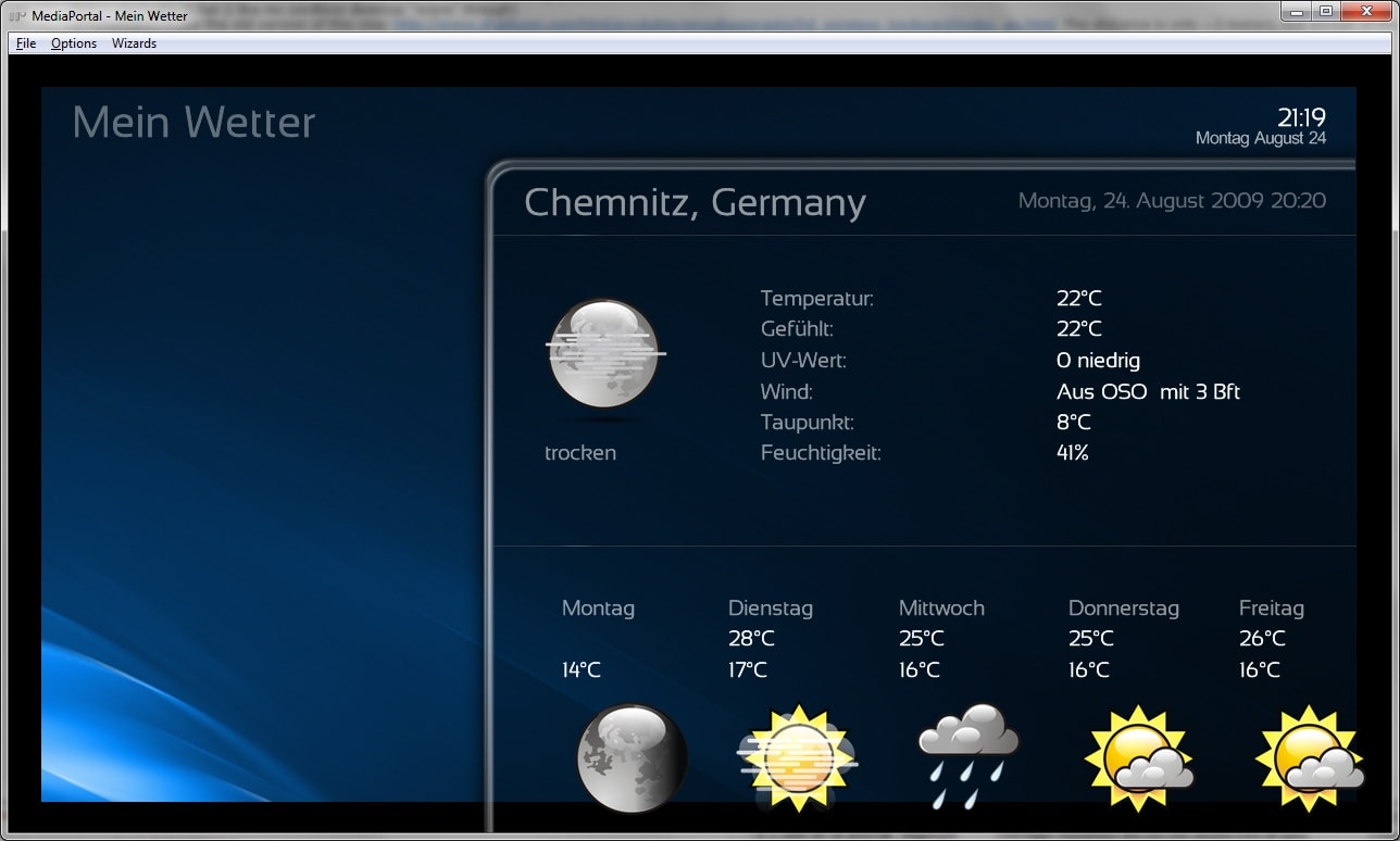
I'm using a CRT with some overscan. is it possible to keep some limited border on left, right, and botton (i.e. weather icons are aligned to the very bottom without a pixel space)? When using screen calibration it's getting worse (black border, logos outside, see attachment)
I have a fix in the next release for the weather screen. Basically i've given to the icons fixed height and width so that even in stretched resolutions everything should be kept in proportion.
The CI menu dialog is not working, title and options are overlaying
For this screen i took a wild guess! I don't have a common interface to test the screen on.
I have a new version for the page in the next release that should be much better. Please test it and tell me if it is ok or not!
Thank you very much for reporting these issues!
I hope i've have fixed them in the right way!
Bye
Tgx
I'll try to investigate about this issue for the next release!Nice Skin but Audiolevel and Mute not show on TV by MP 1.1
Thank you!
Tgx
P.S. Have you checked the option "Show default Volume Osd for full screen video" in the configuration editor?
- March 24, 2007
- 12,070
- 7,459
- Home Country
-
Germany
- Moderator
- #68
I have a fix in the next release for the weather screen. Basically i've given to the icons fixed height and width so that even in stretched resolutions everything should be kept in proportion.
the 1st part seems to be a small misunderstanding: my screenshot showed the "screen adjusted" version, that's why there are black borders.
what I mean is something different: when controls are placed at the very border, they are partly outside of screen (due to overlay). this applies also zu TvMiniGuide, there are the logos cut off some pixels
my ask is to have important controls and items not directly attached to screen-borders, but having some space (like 20 pixel to each side).
Edit:
I changed the screen adjustment a bit more. I now can nearly see all controls completly. this adjustment wasn't needed in b3wide, so some more space to borders would be great (also see other's replies not to use whole screen width)
The CI menu dialog is not working, title and options are overlaying
For this screen i took a wild guess! I don't have a common interface to test the screen on.
I have a new version for the page in the next release that should be much better. Please test it and tell me if it is ok or not!
If you want I can adjust this dialog, as I created the b3(wide) dialog version. I also can test well, because I have CAM in dev PC available.
Congrats - Your skin looks very stylish and I love that I'm finally able to read everything on my 32" TV with a nice, big, clear font!
Here are my comments/suggestions for your skin:
1. Don't like the Home Screen background, I'd prefer a simple Monochrome-like menu without a big background picture if you know what I mean (I ended up deleted bg_homefull.png and replaced it with a copy of bg.png)
2. Could you please speed up the Fade in/fade out times, IMO it's a bit too slow for everyday use..
3. Alot of the "pop up" screens (e.g. the "TV now" when watching TV) are using the max width, would probably be nicer with a little more space between the sides and the "pop up"
4. In general, I'm not a big fan of the "fade from right" menus. I prefer a centered pop-up
5. My TV Series: I can't seem to get posters to show (using "List Posters" view)
6. My TV Series: I'd probably prefer the list of tv series left or centered, it somehow looks "wrong" to me when menus are to the right
7. One last thing - Probably prefer the OSD progress bar at the top rather than at the bottom...
Well, enough bitchin' , I'm probably a bit old fashioned on skins Really like your skin, looks beautiful apart from the things mentioned above..
/Christian
Here are my comments/suggestions for your skin:
1. Don't like the Home Screen background, I'd prefer a simple Monochrome-like menu without a big background picture if you know what I mean (I ended up deleted bg_homefull.png and replaced it with a copy of bg.png)
2. Could you please speed up the Fade in/fade out times, IMO it's a bit too slow for everyday use..
3. Alot of the "pop up" screens (e.g. the "TV now" when watching TV) are using the max width, would probably be nicer with a little more space between the sides and the "pop up"
4. In general, I'm not a big fan of the "fade from right" menus. I prefer a centered pop-up
5. My TV Series: I can't seem to get posters to show (using "List Posters" view)
6. My TV Series: I'd probably prefer the list of tv series left or centered, it somehow looks "wrong" to me when menus are to the right
7. One last thing - Probably prefer the OSD progress bar at the top rather than at the bottom...
Well, enough bitchin' , I'm probably a bit old fashioned on skins
Really like your skin, looks beautiful apart from the things mentioned above../Christian
- Moderator
- #70
just 2 remarks mate for this great skin.
1) at basichome will you give the possibility to choose which items you want to show up there? like streamedmp has or xfactor.
Not for the moment... I don't have the capabilities to make such an application!
I think I could provide new buttons for every new plugin so that anyone could "build" his own basichome.
I know it'll be lots of work, but should you release a "Basic home pack" with these kind of images, wouldn't you have to make each picture fit anywhere on the basic home? Say someone wants the top row to have MyVideos, Moving Pictures and My TV-Series, and someone else wants these in the bottom row, and with some different placement, that'll be 15 folders (1 per position) and each should then contain 1 fitting image for each plugin, right?
Edit: Perhaps releasing a .psd file for each position would be easier?
:sorry:
Emph
Users who are viewing this thread
Online now: 2 (members: 0, guests: 2)