Denmark
I don't know, I kinda like it on that side.I could put the info box on the other side?
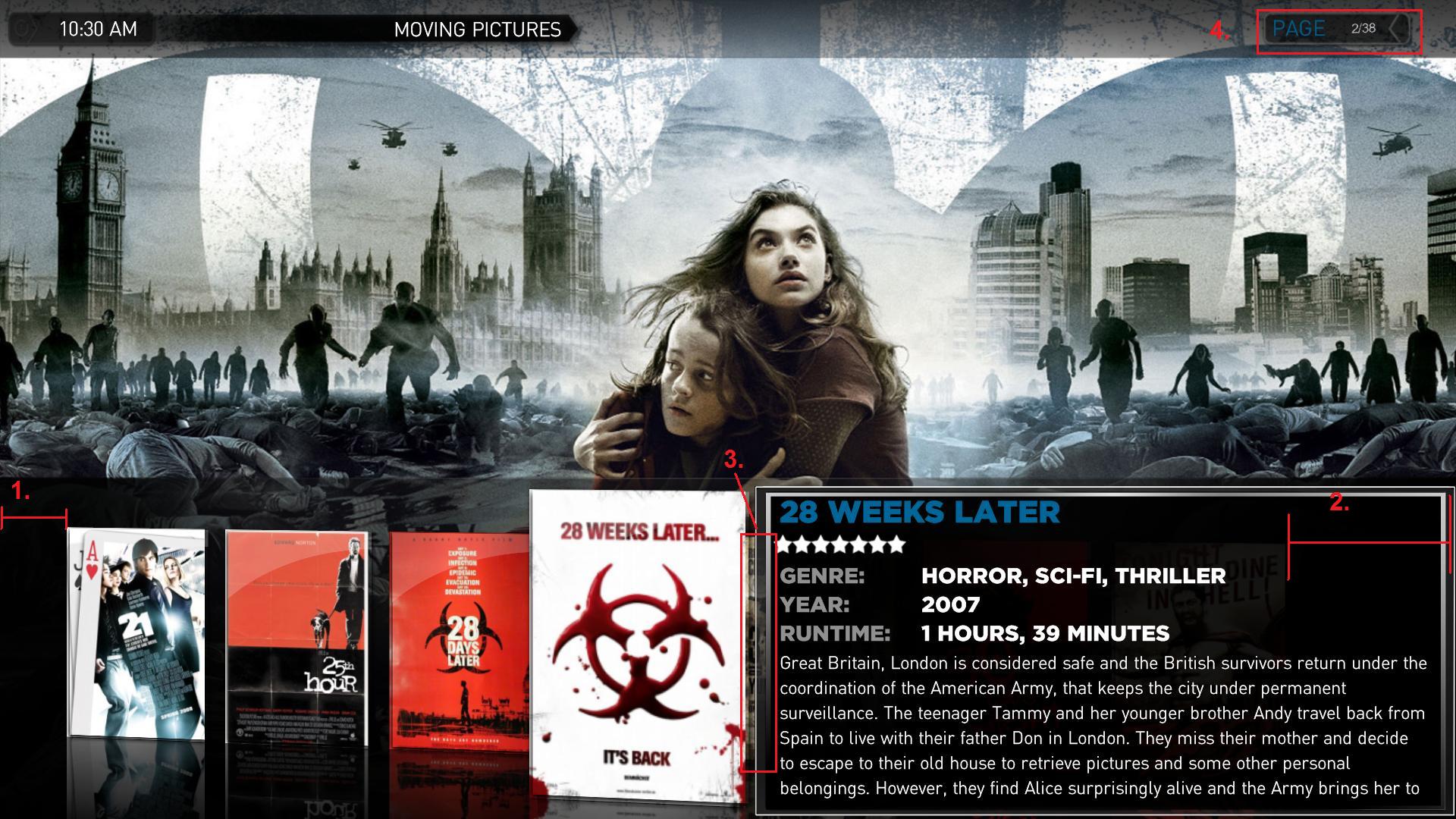
I have another idea, but its much easier with a picture to go with the explanation. Excuse me for the bad job on the MS paint...
It seems to me that the space under 1 is smaller than the space under 2. what if you made 1 a little smaller and 2 a little bigger, in order to show some more of the cover, jus visible under 3. Perhaps resize the covers abit, to make more room?
And about the border around the infobox, how about make it rounded, kind of the same style as 4
Another thing, I just thought of:
The space under 2 could possibly be where the mediainfo-logo's went, when that gets implented in moving pictures? Perhaps limit to 2-3 logos to not clutter the screen. If possible, then prioritize the logoes, so if the movie is HDTV, this would always show, even if there are 5 other mediainfo logos? Just a thought.
 alot for listening to all the ideas we provide in this thread. I have absolutely no skinning or coding knowledge, so the only way I can help with MP is to come up with ideas - and its great to see that they are appreciated