Germany
- Thread starter
- Moderator
- #51
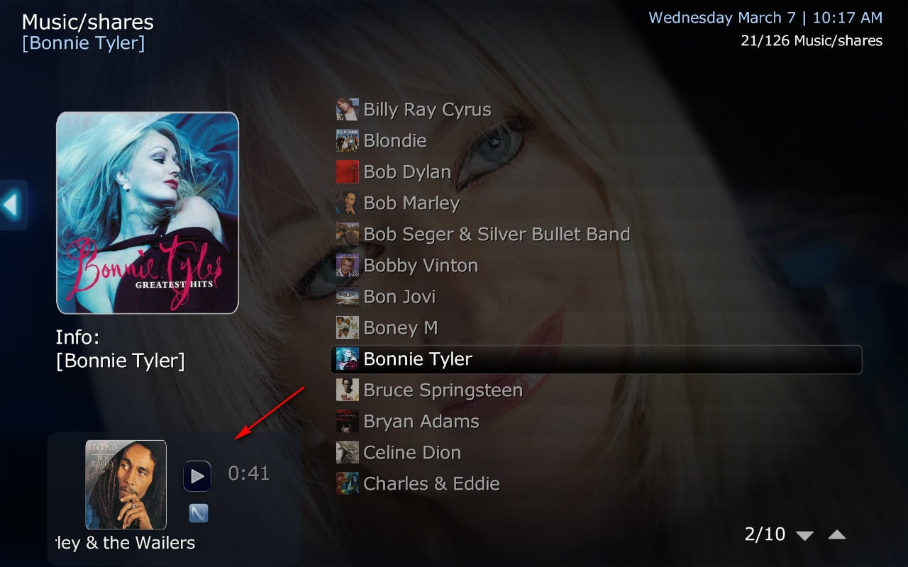
Well, I don´t think so.Sure has a purevision feel")
In fact the whole rework is based on the original Blue/Wide skins with only GFX and font changes and some small adjustments

Well, I don´t think so.Sure has a purevision feel
 )......)
hi catavolt , the issue with basic home (reported 2 post up) as bin fix ?New xmls in first post