New Zealand
- Thread starter
- #11
If you read the post, there will be 3 versions.
(1) Fullscreen Fanart
Basically a minimalistic version with fullscreen fanart, very similar or exactly the same as the first pic. This is the easiest screen to make. It will look very close to this pic.

(2) Windowed Fanart - Version 1
A fairly minimalistic version with non fullscreen fanart. This is because if you look in the artist thumbs directory you will see that most of the thumbs are too low resolution to be dispalyed fullscreen. This screen does not have to support all the skin elements so hopefulyl wont look cluttered. I have already done some work on this screen, it will probably look something like the image below.

Ideally I'd like to move all the extra stuff to a pop out side menu (see below), however it currently isn't possible unless a programmer rewrites the nowplaying plugin code.

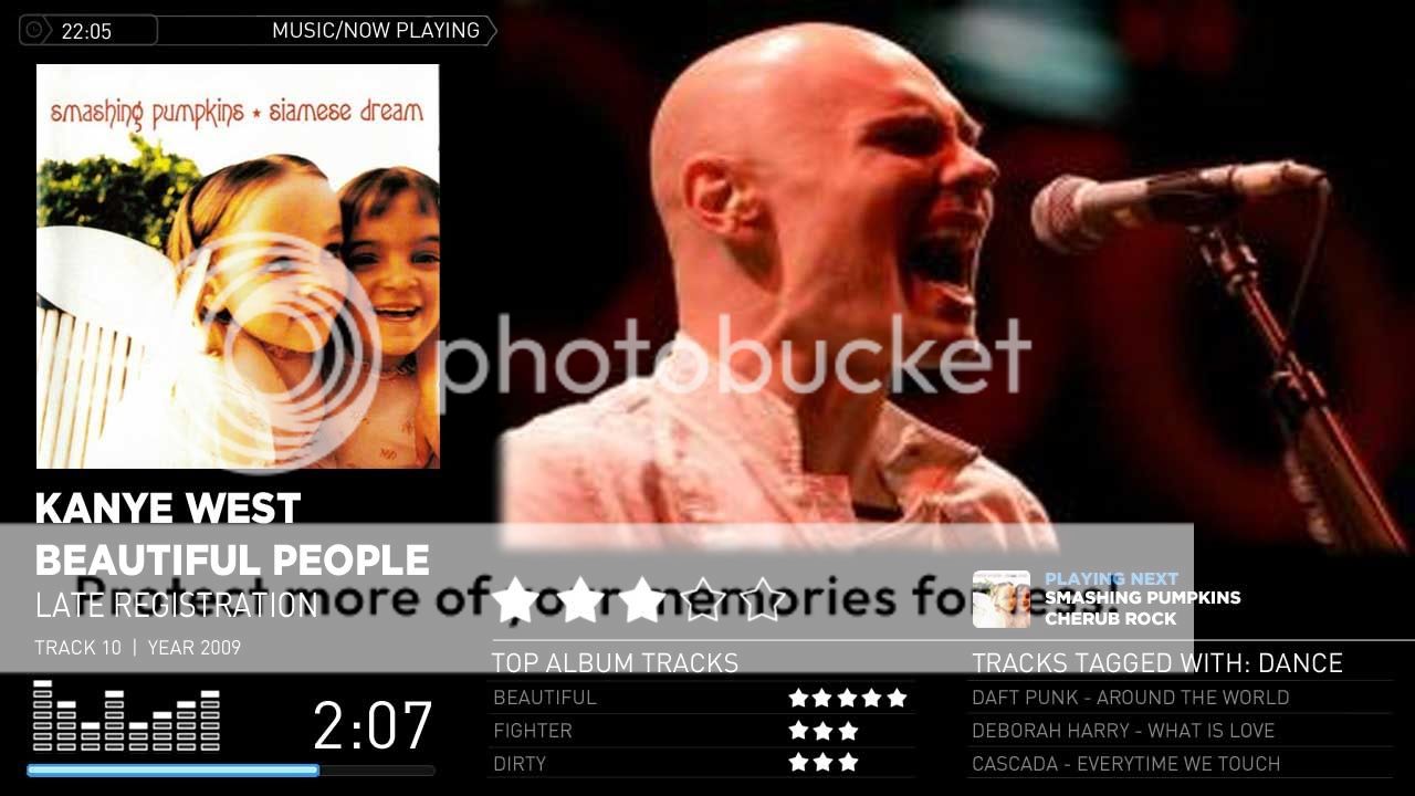
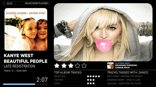
(3) Windowed Fanart - Version 2
This version has to support all the default skin elements, and might end up being the default now playing fanart screen. It's always gonna look cluttered, but I'm trying to find the best way that it doesn't look too cluttered, this is the hard one to design and why i made this thread. It will look something like the pic below and has to include all the below elements. (eg. track list , equaliser etc..)

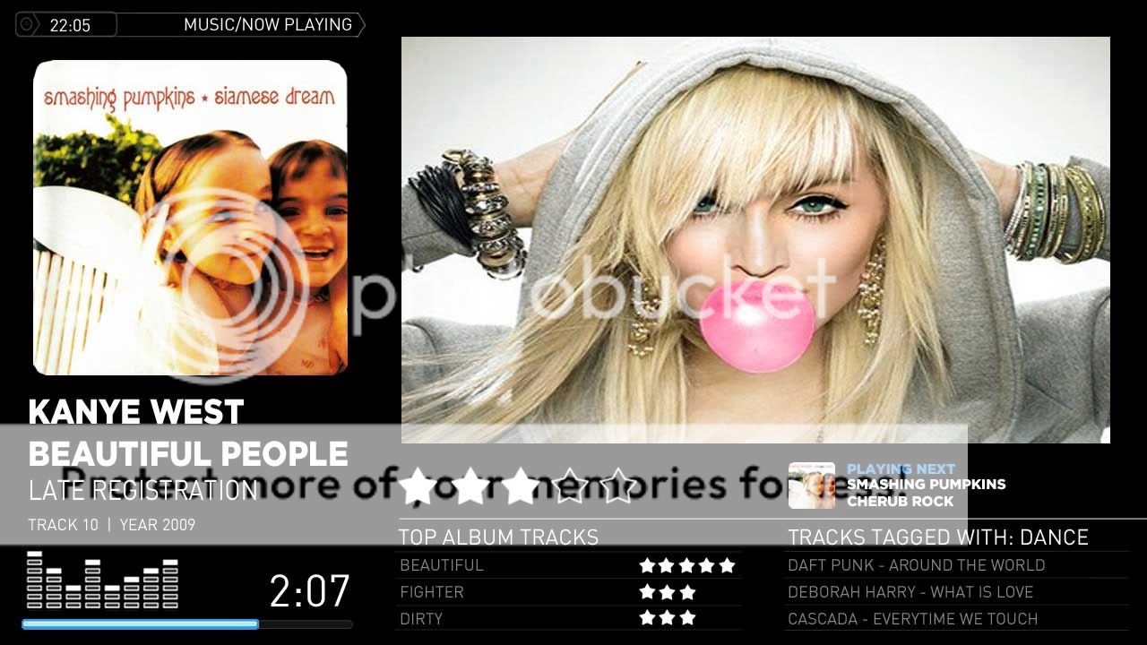
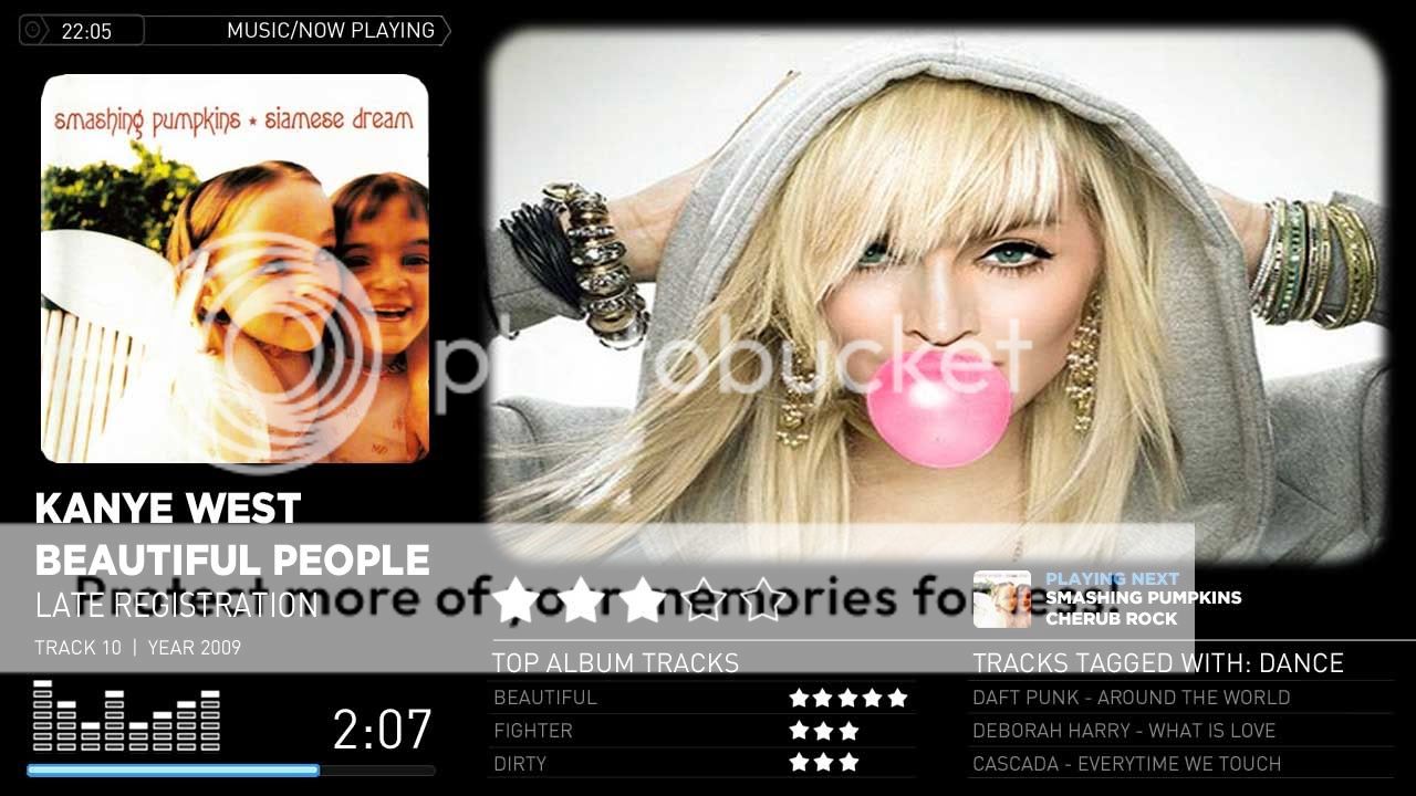
No problems, I really want ideas to try. I will post a few examples with your suggestion of a fully black background, and I'll post you a sample without any fading and we can see what it looks like!


I think you are right, a plain black background helps a lot with the clutter!
(1) Fullscreen Fanart
Basically a minimalistic version with fullscreen fanart, very similar or exactly the same as the first pic. This is the easiest screen to make. It will look very close to this pic.
(2) Windowed Fanart - Version 1
A fairly minimalistic version with non fullscreen fanart. This is because if you look in the artist thumbs directory you will see that most of the thumbs are too low resolution to be dispalyed fullscreen. This screen does not have to support all the skin elements so hopefulyl wont look cluttered. I have already done some work on this screen, it will probably look something like the image below.
Ideally I'd like to move all the extra stuff to a pop out side menu (see below), however it currently isn't possible unless a programmer rewrites the nowplaying plugin code.
(3) Windowed Fanart - Version 2
This version has to support all the default skin elements, and might end up being the default now playing fanart screen. It's always gonna look cluttered, but I'm trying to find the best way that it doesn't look too cluttered, this is the hard one to design and why i made this thread. It will look something like the pic below and has to include all the below elements. (eg. track list , equaliser etc..)
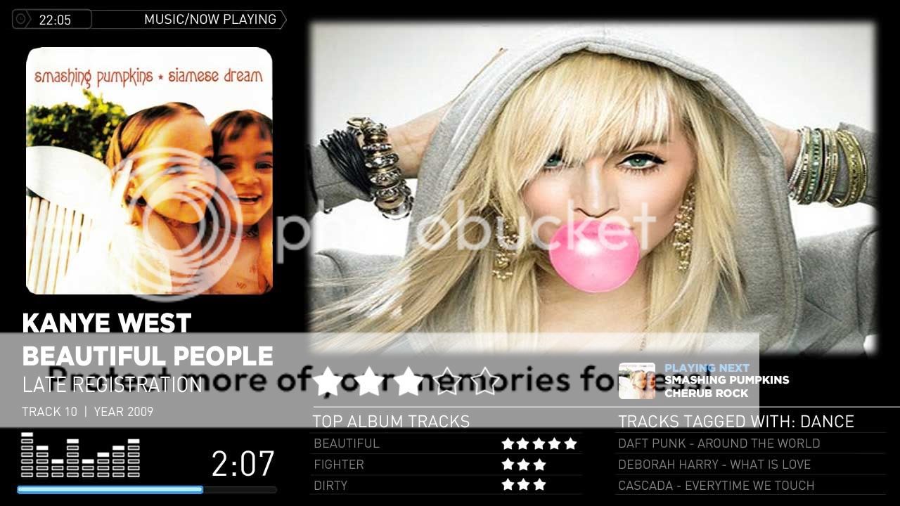
I think the idea behing the mod is great, however I really dislike the "fading" effect used with the fanart. I personaly would really prefer some kind of fixed place or frame were the image would be shown. There is already quite a lot of information on screen and this combined with a very busy background (the soundboard) makes it a bit cluttered up I think. I hope you understand what I mean and please don't feel offended because that was certainly not my intent, thanks for all your effort!
No problems, I really want ideas to try. I will post a few examples with your suggestion of a fully black background, and I'll post you a sample without any fading and we can see what it looks like!
I think you are right, a plain black background helps a lot with the clutter!