MediaStream skin for MP (3 Viewers)

Status
Not open for further replies.

mattsk88

Community Skin Designer
March 27, 2008
363
216
I was gunning for 1366 x 768 mainly because thats the res most of the widescreen skins use. It also allowed me to reuse some xmls of my other skins so only minor adjustment was needed. But if thats the case then ill do a bit of extra work and just use 1280x720. Don't expect an exact port of the skin as there are layouts that I personally think aren't all that flash. I'm also focusing on fanart more than mediastream does.
 

mattsk88

Community Skin Designer
March 27, 2008
363
216
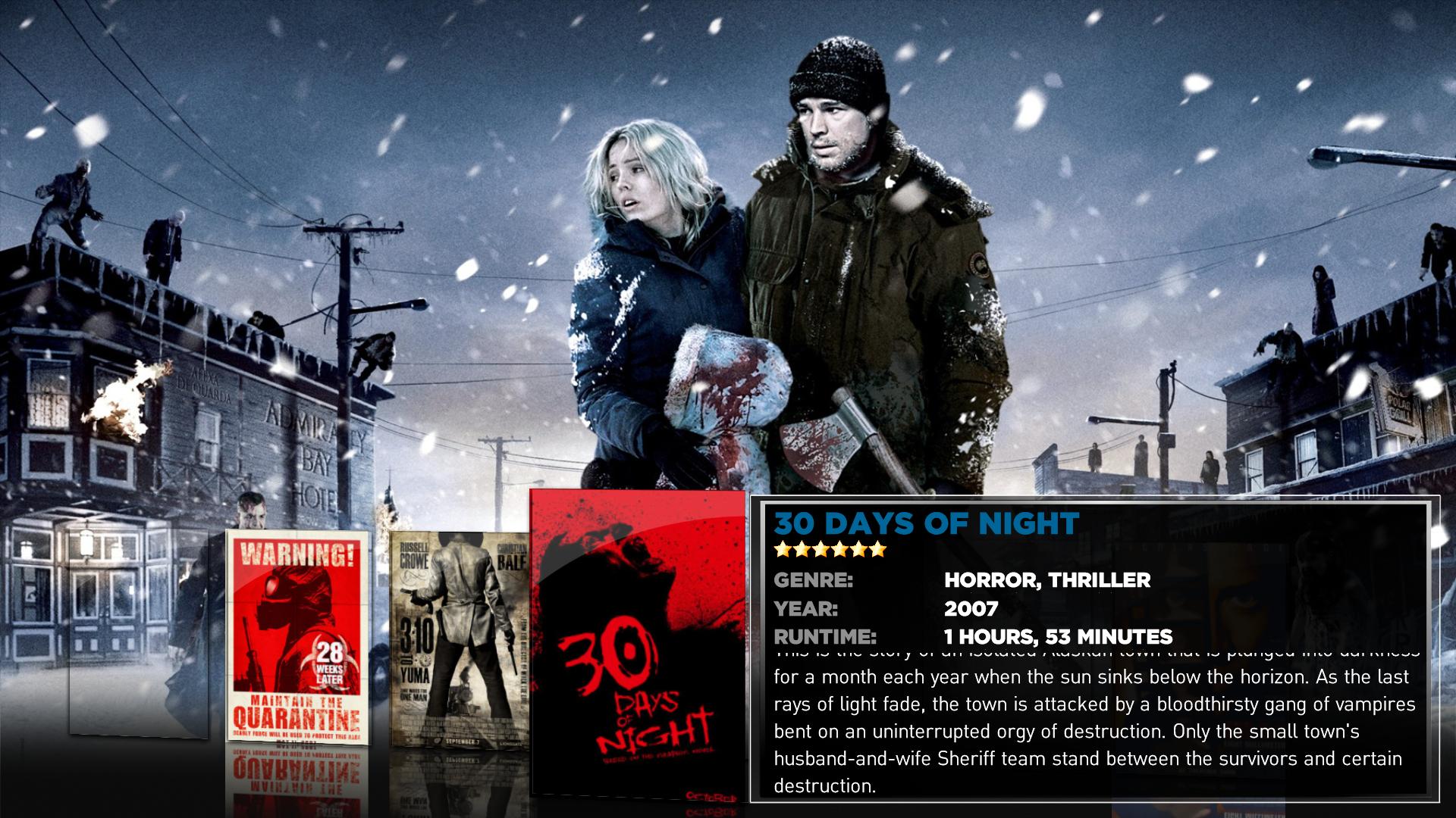
MyTV Series and Moving Pictures will have large fanart support as these plugins support it well. Here is an early look at filmstrip from Moving Pictures.
 

Attachments

  • streamed- Moving pictures.jpg
    streamed- Moving pictures.jpg
    327.9 KB

zicoz

MP Donator
  • Premium Supporter
  • September 3, 2006
    896
    63
    Home Country
    Norway Norway
    Any chance the TV part will look like the top screenie here?

    http://img404.imageshack.us/img404/4473/ss1mj5.jpg

    I've just really fallen in love with that look. One single vertical row of TV-show banners, and as you browse to the next one the info and fanart switches to the selected one. Much like MovingPictures does for the movies. It might take a bit longer to navigate, but imo it's easier on the eyes, and more functional with one column instead of three.

    It's a bit off the original Plex, but imo it's a great look, and it IS sort of a more FanArt oriented look of the Mediastream skin since that aswell has a singe column.
     

    mattsk88

    Community Skin Designer
    March 27, 2008
    363
    216
    Any chance the TV part will look like the top screenie here?

    http://img404.imageshack.us/img404/4473/ss1mj5.jpg

    I've just really fallen in love with that look. One single vertical row of TV-show banners, and as you browse to the next one the info and fanart switches to the selected one. Much like MovingPictures does for the movies. It might take a bit longer to navigate, but imo it's easier on the eyes, and more functional with one column instead of three.

    It's a bit off the original Plex, but imo it's a great look, and it IS sort of a more FanArt oriented look of the Mediastream skin since that aswell has a singe column.

    Im going to be working on tvseries, unfortunately this type of view isn't really all that possible with the way fanart is currently handled with the plugin, ill try to contact one of the developers to see if anything can be done about this. I can say that the tvseries desgin will differ to the xbmc mediastream tvshows design.

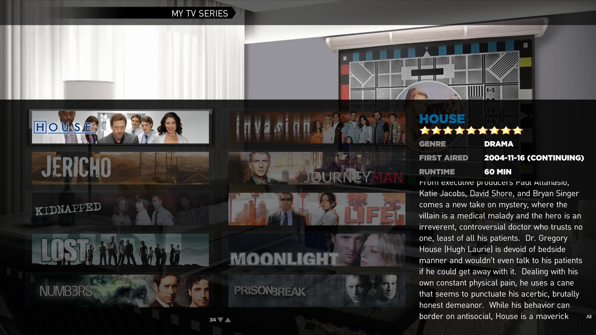
    Update - I have attached a screenshot of the current tvseries banner page, criticism welcome:D
     

    Attachments

    • streamed-tvseriesmain.jpg
      streamed-tvseriesmain.jpg
      233.5 KB

    jonaskp

    Portal Pro
    October 23, 2006
    438
    15
    Home Country
    Denmark Denmark
    MyTV Series and Moving Pictures will have large fanart support as these plugins support it well. Here is an early look at filmstrip from Moving Pictures.


    Looking good. Although if possible, it would be great if the selection weren't on the far right, but rather on the spot where "28 weeks later" is. This should be possible, I think they added the support for "Centering Filmstrip" some SVN ago, and it should be in RC3. Or am I totally wrong.

    I also can't figure out if I like the design, but might just be something to get used to. What I mean is, the way that the covers are on one side, and the textbox on the other side, and nothing on the top. But this might look great on the big screen, i don't know. Maybe I've just gotten used to the look of i.e. Titanium where the Title is on the top of the screen.


    Suggestion: Would it be possible to make the text-box a little opaque and have the covers on the right of the selection go behind it? Don't know if this would look weird or maké the text hard to read, but to me it looks like something is missing, when there is only 4 covers - It does not give the impression of that mighty big movie Collection it took me so long to build :D

    Anyway, the above is just something to think about, can't wait to take a look at a working alpha/beta-release of this :D
     

    mattsk88

    Community Skin Designer
    March 27, 2008
    363
    216
    MyTV Series and Moving Pictures will have large fanart support as these plugins support it well. Here is an early look at filmstrip from Moving Pictures.


    Looking good. Although if possible, it would be great if the selection weren't on the far right, but rather on the spot where "28 weeks later" is. This should be possible, I think they added the support for "Centering Filmstrip" some SVN ago, and it should be in RC3. Or am I totally wrong.

    I also can't figure out if I like the design, but might just be something to get used to. What I mean is, the way that the covers are on one side, and the textbox on the other side, and nothing on the top. But this might look great on the big screen, i don't know. Maybe I've just gotten used to the look of i.e. Titanium where the Title is on the top of the screen.


    Suggestion: Would it be possible to make the text-box a little opaque and have the covers on the right of the selection go behind it? Don't know if this would look weird or maké the text hard to read, but to me it looks like something is missing, when there is only 4 covers - It does not give the impression of that mighty big movie Collection it took me so long to build :D

    Anyway, the above is just something to think about, can't wait to take a look at a working alpha/beta-release of this :D

    The movie selected is the center one there are another 3 covers behind the info box lol (the only problem with this is the the last three movies will be underneath the info box). I haven't decided exactly what the finished filmstrip will look like as of yet as im still tossing up whether I should have the title up the top ala titanium style. List view should make your movie collection look more impressive :D.

    @mattsk88 - you are doing great job here! I really like that skin and I tried xbmc just because of it but MP just works better... Great job so far, but looking at tvseries skinning so far, you are missing 1 or 2px white fading line on the edges of the black part which gives it a more 3d embedded look.. Have a look here:
    http://www.teamrazorfish.co.uk/mediastream/090_episodes.png
    Pilehave is also doing a lot of work on the skin so send thanks his way as well :D. Regarding the graphics issue, the graphics being used aren't as fancy as mediastream because we aren't as good with photoshop. Hopefully the mediastream team will open there graphics up to being used by the wider skinning community. The main time spent at the moment is doing all the layout etc, graphics polish will come later. Im also trying my hand at a bit of programming to get a basichome menu editor included with the skin, stay tuned:D.
     

    joz

    Portal Pro
    March 17, 2008
    1,353
    306
    Home Country
    Netherlands Netherlands
    mattsk88 and Pilehave I really, really appreciate all the effort you're putting in this great skin. As it looks like it's gonna replace my default skin (Aeon Wide) as soon as this one comes out.

    Keep up the great work!
     
    Status
    Not open for further replies.

    Users who are viewing this thread

    Similar threads

    MP1 MP2 Skin-engine quirks DE
    wow this is a weird construction,that will heavily depend on execution order of those 2 parameters in the iff And as you found out, in your case the order is probably the other way around than you expected...
    wow this is a weird construction,that will heavily depend on execution order of those 2 parameters in the iff And as you found out...
    onfocus Recently I tried coding this: <onfocus>#(iif(eq(#skin.search.id,0),skin.setstring('#skin.search.id',10)))</onfocus>...
    Replies
    1
    Views
    199
    I think 1.38 is easier, it's a minor addition, judging by the lack of bugs, 1.39 is still a long way off. Ideally, the TuningParameters settings would be moved to MPE1, along with all the skins. Then any minor fixes could be updated quickly.
    I think 1.38 is easier, it's a minor addition, judging by the lack of bugs, 1.39 is still a long way off. Ideally, the...
    Hello and good morning, atm I´m gonna try to install my new MP2 Server with a hybrid solution DVB-T2 and MagentaTV. For DVB-T2 I...
    Replies
    9
    Views
    3K
    MP1 MP2 MP Shutting down DE
    I got a similar error yesterday just when a watched episode ended... Didn't copy the logs unfortunately but now i'm in a weird situation. Trakt website shows that episode as watched, but in onlinevideos (where i watched that episode) it still is not flagged as watched. The watched.json doesn't contain that episode but i think it...
    I got a similar error yesterday just when a watched episode ended... Didn't copy the logs unfortunately but now i'm in a weird...
    I have an issue that started in 1.37 and so I updated to 1.38 and updated all my installed plugins but the issue has continued. My...
    Replies
    6
    Views
    647
    MP1 MP2 Design questions. DE
    No No
    No No
    Is there an xml display utility that will allow graphically checking of dialog and osd text and graphics element placement? or Is...
    Replies
    1
    Views
    2K
    I do not know why this xml was in my theme folders, it must have sneaked in some time ago (years?). I simply removed the file. The Latest Media Handler plugin seems to be working as expected. I've had no lock-ups.
    I do not know why this xml was in my theme folders, it must have sneaked in some time ago (years?). I simply removed the file. The...
    Before you create this bug report: Make sure that your system (windows, codecs and drivers) is up to date, matching the...
    Replies
    13
    Views
    4K
    Top Bottom