- Thread starter
- Moderator
- #21
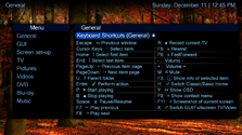
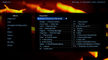
I darkened the top label background, which helped to set off the heading from the body because of the larger fonts) I also had removed arrows, then used colons followed by 2 spaces (gave me more room for line length). I like the extra icons; to be more uniform. I considered arranging the list by function (as you suggested) based on likely most used functions, eg, navigation, playing, and other.@2BitSculptor @TLD
After adding some more icons and replacing the arrows with colons, the new screen look like this:
The attached XML has the coloured topbar commented out (this will be the official screen in next release), but you can remove the tags and let the topbar show
Hope you´ll like it
BTW: Should we change the orden of the items, e.g. first all playing items, then all navigation items, then the rest - or e.g. alphabetically?
What do you think?
Last edited:

 United States of America

